Executive dashboard
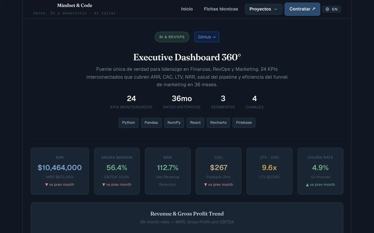
Twenty-four executive indicators on one screen, and they all reconcile.
Data and BI · Python · Browsable demo
The problem
A board argues over numbers pulled from five different spreadsheets, none of which agree. The hard part is not drawing charts: it is making MRR × 12 equal ARR, margins deriving from cost of sales, and EBITDA never exceeding gross profit.
What it does
- Generates an internally consistent data model where every indicator reconciles with the rest.
- Covers four business domains: finance, retention, RevOps and marketing.
- Feeds a dashboard with revenue trend, segment and channel breakdown, funnel, CAC against LTV and churn against NRR.
- Exports the tables as CSV, ready for Power BI or for the front end.
What was decided while building it
- ARR is not reconciled, it is built
- ARR comes from multiplying MRR by twelve, and margin from subtracting cost of sales from revenue. There is no separate sheet to reconcile afterwards: the relationship lives in the line of code that produces the number, and a test stops the two from drifting apart.
- The funnel is built backwards
- It used to be generated forwards, which produced months with more closed customers than qualified opportunities: a hundred and fifty per cent conversion rate, published on a dashboard that promises its numbers reconcile. It now starts from the customers and works up to the leads, and a test requires each step to be smaller than the one before it.
- The accounting hierarchy cannot be broken
- EBITDA cannot exceed gross profit, and gross profit cannot exceed revenue. It sounds obvious, and it is exactly what breaks when each figure is generated on its own. Here each one derives from the previous one and there is a test for every inequality.
- Segments add up to the total; channels, almost
- The segment breakdown is normalised and adds up to the full revenue figure. The channel one carries noise on purpose and stays under five per cent of drift. It is said here because a breakdown that silently fails to add up is the fastest way to lose trust in a dashboard.
How far it goes
- The data is synthetic and generated from a fixed seed. Revenue nearly doubling over three years is not a finding: it is the input parameter read backwards.
- Internal consistency is not external validation. ARR being twelve times MRR holds because a line of code writes it that way, not because the model portrays any real company.
- Retention is computed over cumulative sign-ups, not by following cohorts from their month of entry. It is a churn rate, not a cohort analysis.
- The tables are not versioned: they are regenerated by running the script. What is published is the generator and its tests, not a dump.
- 24 indicators
- 4 business domains
- 36 months of history
Built with
- Python
- React
- Recharts
Where the data comes from
Synthetic data generated by the repository itself: no client information involved.